-
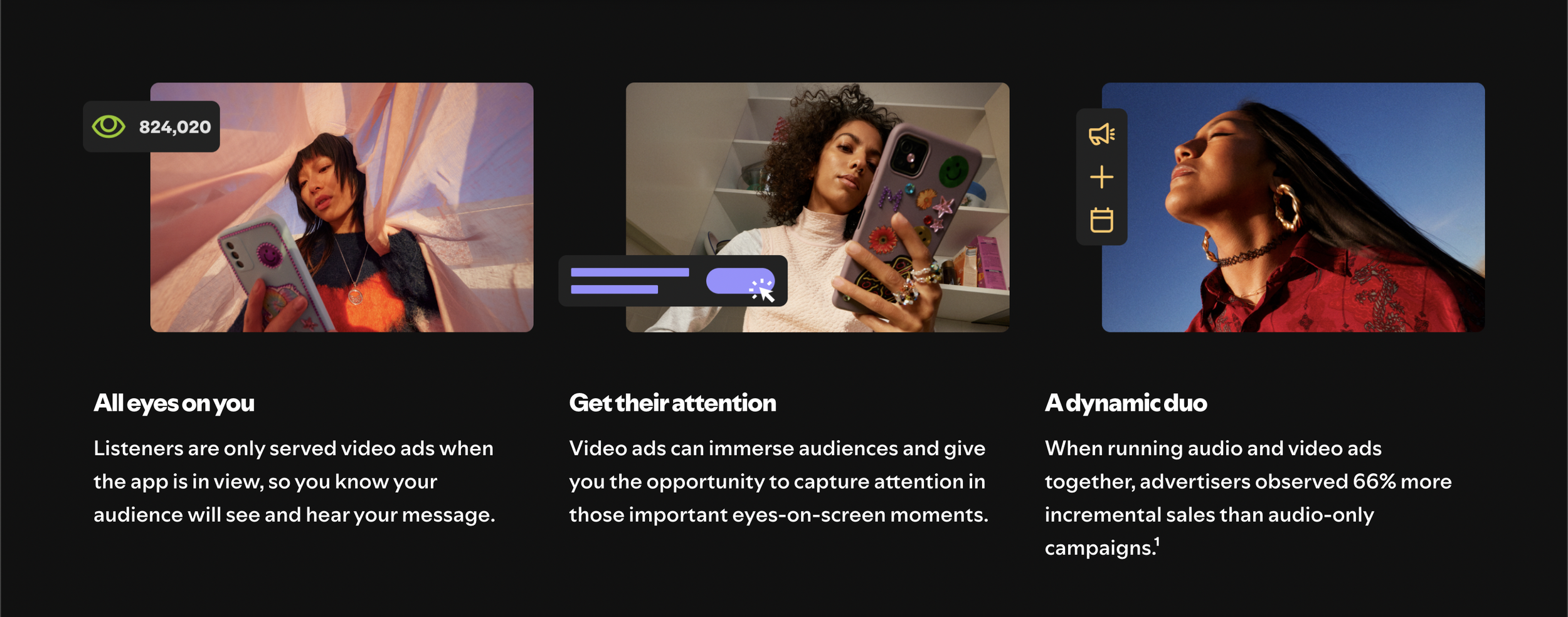
Spotify's ad platform needed a visual refresh to better communicate its value proposition and inspire advertisers. The challenge was to create a system that was flexible, scalable, and visually compelling, while also providing clear guidance for diverse brands.
-
We developed a dual-pronged approach: Abstracted UI and Mock Brands. The Abstracted UI created a visual language that efficiently conveyed Spotify's ad features. Simultaneously, Mock Brands offered tangible examples of how different brands could successfully leverage the platform.
By providing both a foundational visual system and concrete brand examples, we empowered Spotify and its advertisers to create engaging and effective ad campaigns.
-
Design Director
-
Agency: Instrument
Spotify Ads Rebrand
By simplifying the complex, we created a visual language that was both informative and aesthetically pleasing. This system provided a flexible framework for showcasing Spotify's ad products across various marketing channels.

Mock Brand 1: Waggery
Waggery showcased the potential for playful and engaging brand experiences on Spotify. By targeting pet owners, we highlighted the platform's ability to reach a passionate and loyal demographic.


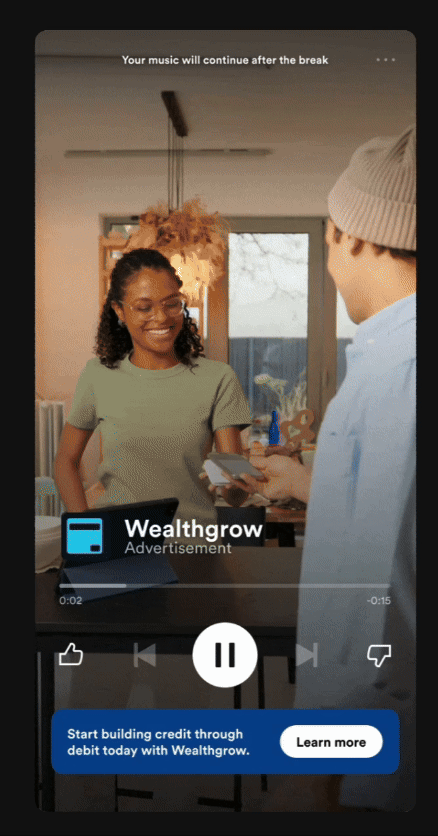
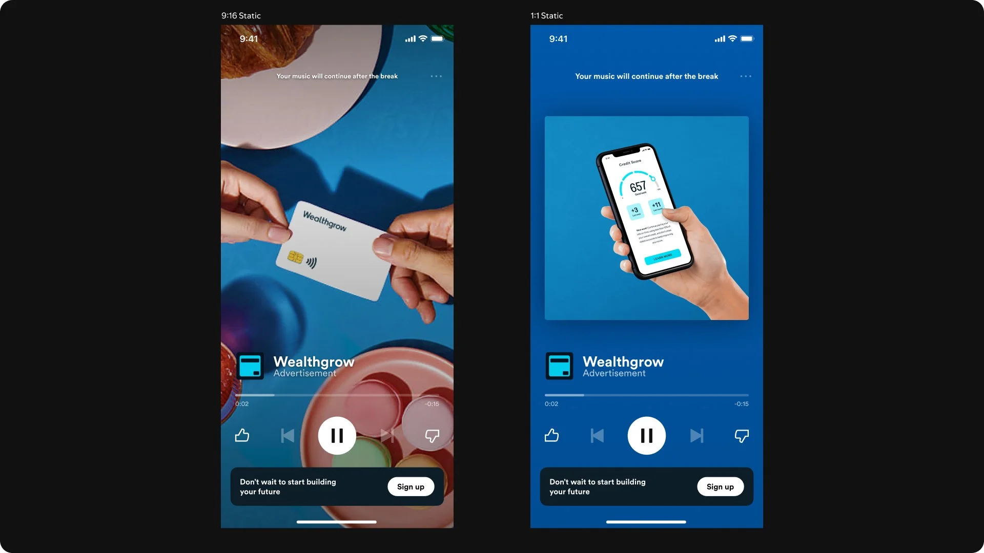
Mock Brand 2: Wealthgrow
Wealthgrow demonstrated how Spotify could be a platform for financial brands to connect with a younger, more digitally-savvy audience. The brand's focus on building credit through everyday purchases aligned perfectly with Spotify's user base.

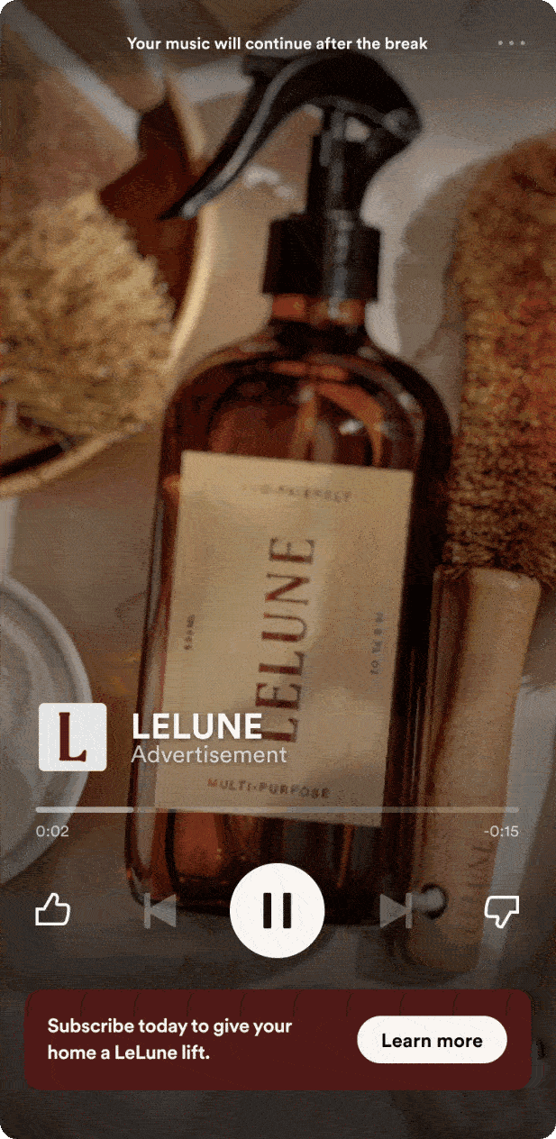
Mock Brand 3: LeLune
LeLune represented the premium end of the spectrum, demonstrating Spotify's capacity to cater to high-end brands. The focus on sustainability and luxury aligned with growing consumer trends.